02.
Solution
Wireframes
I started by looking at aspirational work among competition and conceptual work of other designers. I combined this inspiration into mood boards to help envision how an app might look and to get early feedback on which designs resonate and what to avoid.
We focused on the dashboard to help us establish the UI and set up the design language we could carry through the rest of the application. I started with rough monochromatic wireframes to ensure I captured the business requirements.
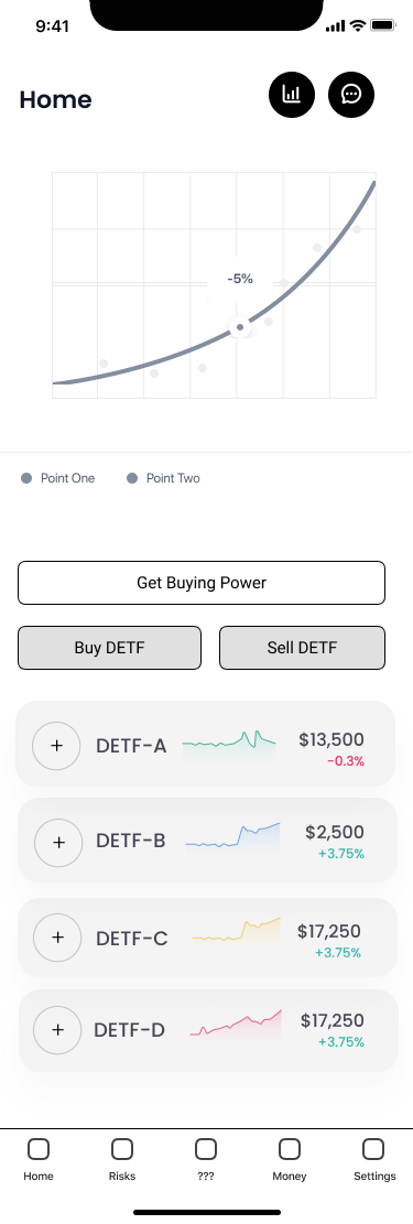
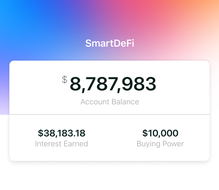
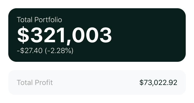
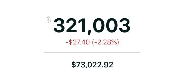
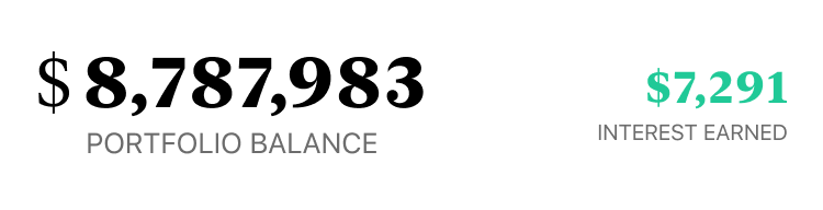
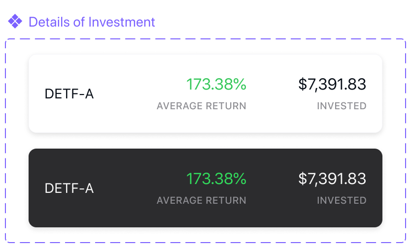
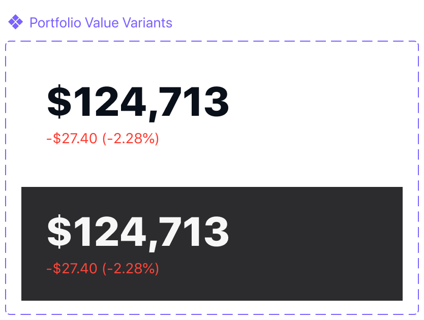
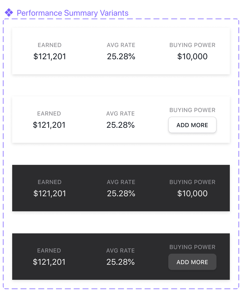
The dashboard needed to contain a few key pieces of data: (1) total portfolio value, (2) year-to-date growth in dollars and percent, (3) customer’s buying power, and (4) summary data for the four different investment funds called Digital Exchange-Traded Funds (DETF’s).
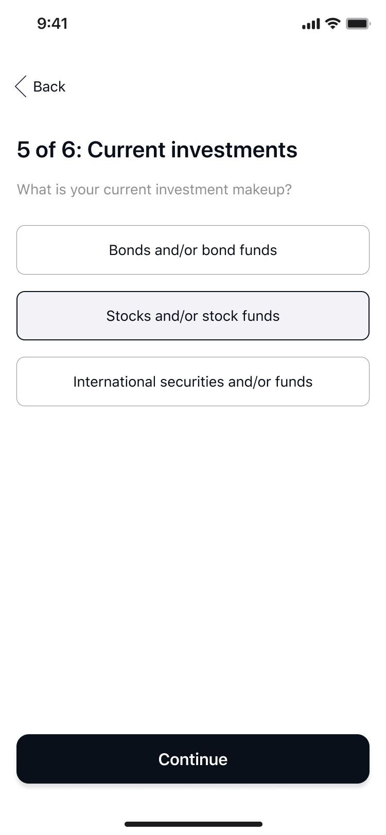
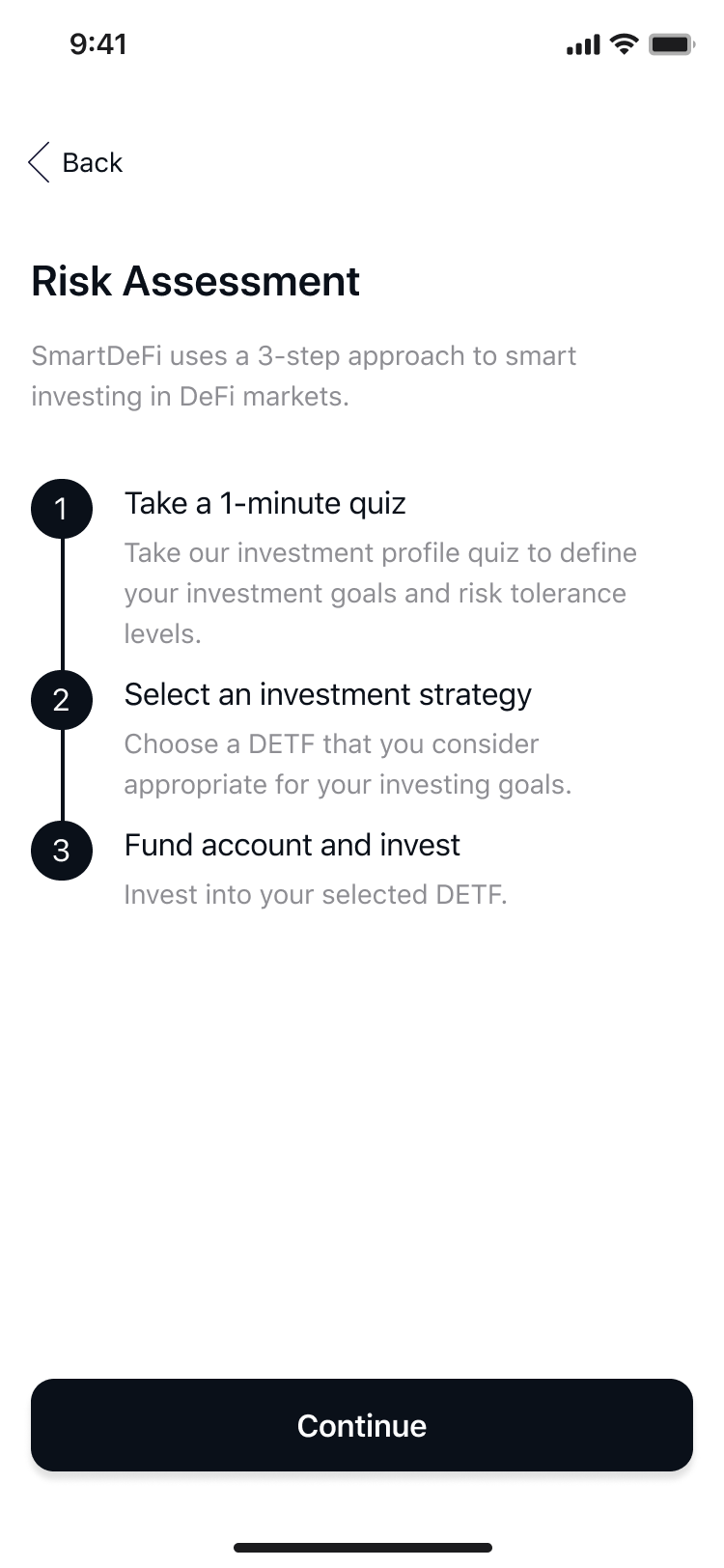
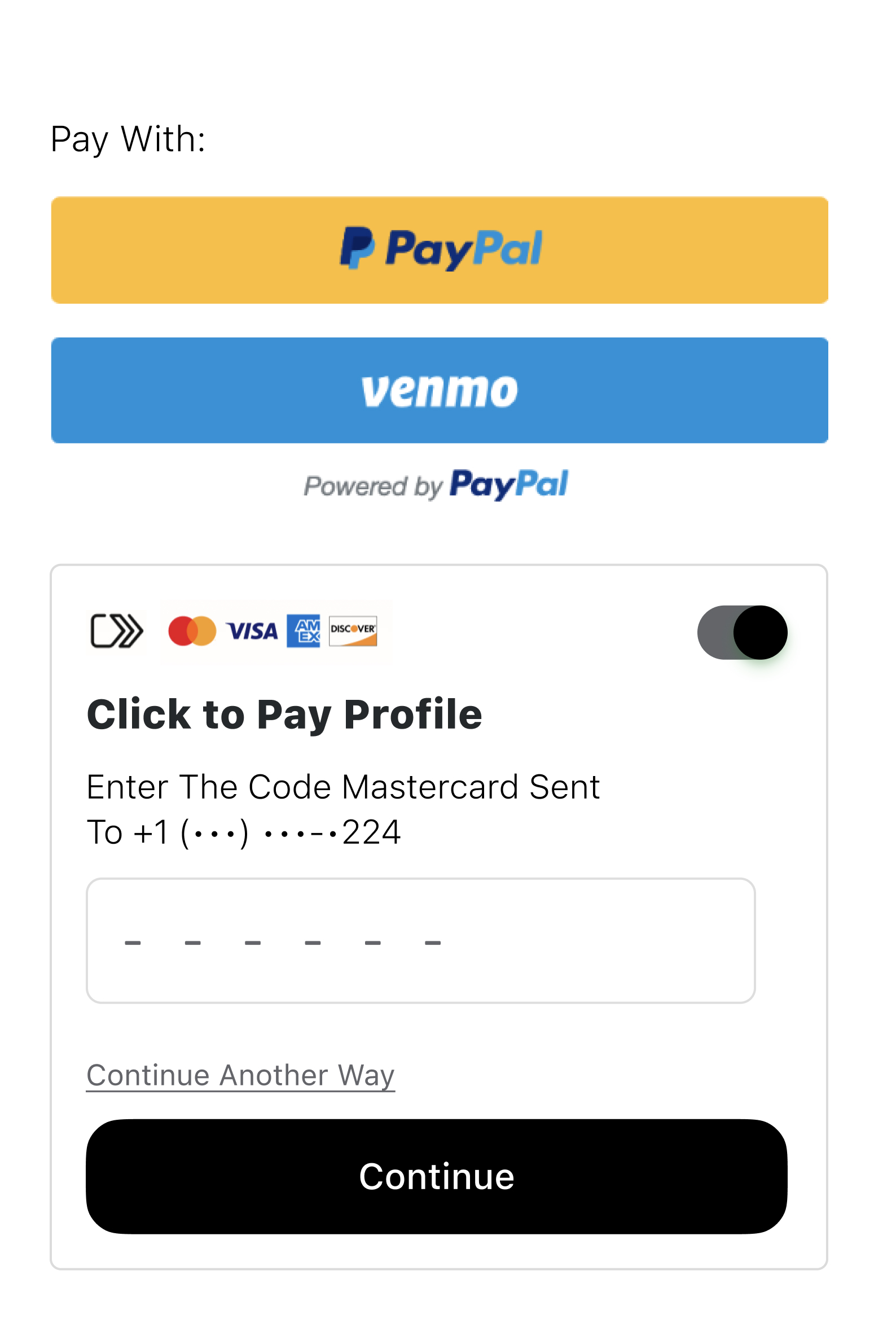
Risk Assessment while Onboarding
I applied my existing knowledge of user sign-up flows through previous experiences to help the team build a modern user experience in a matter of weeks.
ssss.png)
Home Page
Claim Preview
Customizing table
04.
Design
Decision
User Financial Portfolio design
Considerable effort went to ensure visual hierarchy for each of the data points. The most important data should carry the largest visual weight, while secondary and tertiary information needed to be smaller to provide a visual balance.
The 8 point grid system was an invisible but critical aspect to ensuring a consistent design, especially when it came to building the design system and components

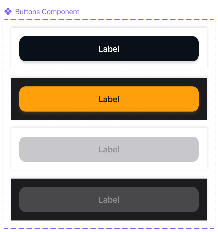
Design system
I developed visual design system for the dashboard to arrive at final visual comps for onboarding. This allowed us to focus on the UX, copywriting, and ensuring minimal barriers to the sign-up flow.
Performance
Labels
Risk Assessment while Onboarding
Home Page
Claim Preview
Customizing table
08.
Conclusion
Reflections

The project was fun from the beginning. I enjoy the crypto space and working in an innovative space and there are many similarities to the Fintech space.
The lessons I gathered in my previous work concerning onboarding, how and what information we choose to collect from customers, all equally apply to the crypto space.