Shop right from your Living Area
Ecommerce TV App
This case study demonstrates how I used creative design solutions to enhance the live show experience by eliminating usability issues and improving app navigation for customers.
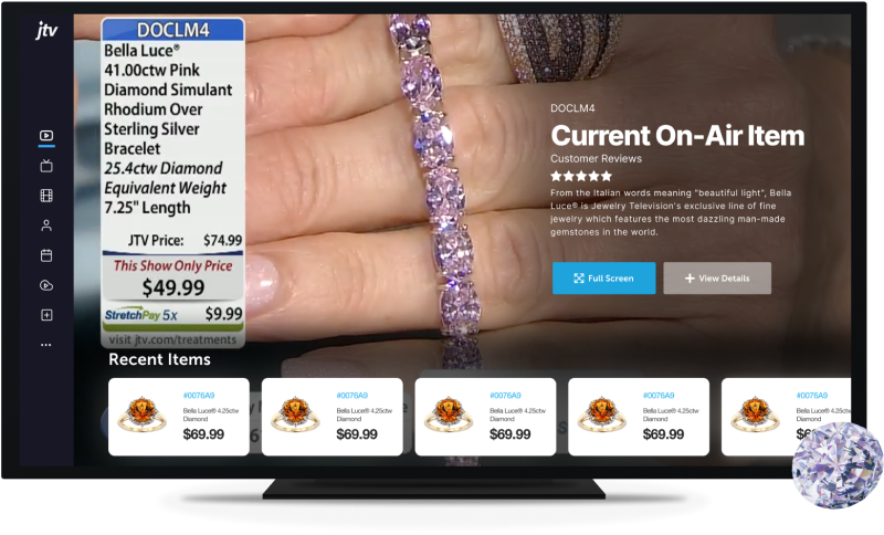
Challenges Spark
Creativity
This project is for a TV app of one of the largest jewelry retailers in the United States. They leverage an omni-digital strategy designed to elevate the customer experience through holistic, digitally-driven touchpoints, including live TV programming, available 24 hours a day to 84 million U.S. households.
The app is already available on Roku, FireTV, and Apple TV. We needed to design it for Samsung and LG, as well as redesign it for previous devices. The goal of this project is to create a TV app that provides a seamless and engaging experience for customers across multiple platforms, ultimately driving sales and enhancing the customer relationship with the jewelry retailer.
The app is already available on Roku, FireTV, and Apple TV. We needed to design it for Samsung and LG, as well as redesign it for previous devices. The goal of this project is to create a TV app that provides a seamless and engaging experience for customers across multiple platforms, ultimately driving sales and enhancing the customer relationship with the jewelry retailer.
My Role
As the sole designer for the project, I conducted research to understand how people were using the existing app. My responsibilities included designing the UX/UI and presenting the design to both the client and the internal team.
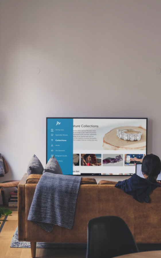
TV users, especially older viewers, require a user-friendly interface with clear and intuitive navigation to ensure they can quickly and easily find the content they want to watch.
Key Challenges
Eliminate the noise
Challenge
The app's information architecture has several primary issues, including low-quality user experience due to poor in-app navigation, inconsistent user experience across devices, and a lack of basic features that are common in most other streaming apps. These issues can lead to user frustration, decreased satisfaction, and a competitive disadvantage in the streaming market
•
No Optimal view of the live shows
•
Navigation Issues
•
Overloaded with text
•
Overall usability issues
From sales and marketing to product management and development, I spoke with everyone I could to understand how the business worked and what the rules were for each region.
Solution
During the initial design sprint, we conducted a collective review of the analytics, user interviews, and client concerns. As the lead, I collaborated with the team to synthesize this information and identify key requirements for the (MVP).
•
Improve content discoverability
•
Change Home design to optimize live video experience
•
Elevate user experience with modified design system
•
Usability audit to improve the overall system
From sales and marketing to product management and development, I spoke with everyone I could to understand how the business worked and what the rules were for each region.
Research
Since it was my first time designing for TV, the first step was to understand the user's mental model.
Why do people watch TV shows for shopping?
Finding Rhythm
Initial Discovery
To get the answers of how and why?
In my initial research, I applied Maslow's hierarchy of needs and found that the app fulfilled most psychological and safety needs. However, it was lacking in addressing self-esteem and self-actualization, as users felt they weren’t skilled at using a smart TV. This was a good starting point to focus on the key usability issues.
Insight: Highlight the key observation.
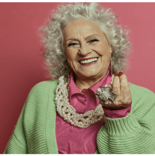
Primary user group: Ages 41-61 (70%).
Action: Suggest a clear and achievable
action to address the observation.
"I am not good at using Smart TV”
Consequence: Show the direct benefit
or outcome of the action.
“Even when sometimes I don't intend to buy anything, I enjoy watching product shows”
Twist (optional): Add a playful or
motivating twist to make it memorable.
“Deliciously profitable!”
Assumptions
•
Outdated design: Users were frustrated with the outdated design, which was filled with confusing UI elements and did not allow them to browse content while watching live or on-demand videos.
•
Limited UsageUsers want a more familiar video streaming experience, as they likely spend more time on other streaming services than on the app.
•
Slow SytemUsers struggle with slow and complicated content navigation, viewing, and management on the TV app.
Research Plan
Interview endusers: Invest time upfront to interview end users This ensures alignment and streamlines the design process, speeding up approvals later on.
Stakeholder Interview: Engage with stakeholders, including senior leadership from the client and the previous team, to align on objectives and expectations.
Review Analytics Data: Analyzing previous end-user usage data drives much of the demand-building activity and informs design decisions.
Interview with Marketing Team: Customize strategies and processes to meet specific marketing needs, ensuring they align with business objectives.
Review TV Design Guidelines: Review TV design guidelines to inform decision-making aligning with device compatibility.
Competitive Analysis: Analyze the most commonly used features and TV experiences to minimize the learning curve and enhance user familiarity.
My PM and I conducted 20+ Zoom interviews, multiple surveys with current JTV app customers and Users to get their thoughts on the old versions of the JTV grid and channel guides, Content discoverability and Ease of Use of the application
User Needs
CHALLANGE
Consistency and Relevance
70% users failed to access the full screen live shows. - User Analytics Data
Opportunity
Users need to be able to get the most optimized view
of the live shows
CHALLANGE
Most users struggle to navigate quickly through the grid to find their desired content.- User Interviews
Opportunity
Opportunity to make navigation quicker and easier, and thus improve overall users-satisfaction ratings and sales.
CHALLANGE
Most users interviewed did not use the channel guide and found it confusing. -User Interviews
Opportunity
Opportunity to make navigation quicker and easier, and thus improve overall users-satisfaction ratings and sales.
CHALLANGE
Less than 5% of users switch back and forth between the grid guide and the channel guide -User Interviews
CHALLANGE
Opportunity to make channel guides easily understandable and quick to access for the users.
CHALLANGE
Users across the board struggled to understand how to use the smaller parts of the App -User Interviews
CHALLANGE
Opportunity to provide more visuals quest for the users to reach to the smaller parts of he app.
Business Needs
•
Users struggle to easily access the latest product launch.
•
Many users had no idea that JTV offers on-demand content
and assumed that it needed to be paid for to access.
•
Product sales information and deals are not properly displayed on the TV apps
•
Improve the conversion rate and get users from viewing to purchasing
Goal
Streamline Internal Workflows
Emphasize improving internal workflows and leveraging their feedback to fine-tune the MVP, ensuring a smoother transition when the product reaches
external users.
Streamline Internal Workflows
Emphasize improving internal workflows and leveraging their feedback to fine-tune the MVP, ensuring a smoother transition when the product reaches
external users.
Get to the Heart of TV
Design principles!
I spent time to understand the webOS TV UX guidelines, which outlines design guidelines for webOS and Tizen TVs. It covers key aspects like supported screen resolutions, ensuring apps display optimally across different TV models for a better user experience.
The scope was defined with a clear emphasis on improving content discoverability by optimizing navigation and enhancing the functionality for live and recent shows.
MVp Features
Understanding to Action
Well everyone was impacted, but amidst the sea of beneficiaries and stakeholders, I managed to focus on the key streams to surf my way through smoothly.
Streamlining App Navigation
We incorporated the original team's
design but made tweaks to improve
discoverability and usability. This
concept was about speed—getting a
solution to market quickly. While it
offered a rapid path to launch, it didn't
deliver the optimal user experience on
mobile devices we aimed for.
Optimizing Live Shows
We incorporated the original team's
design but made tweaks to improve
discoverability and usability. This
concept was about speed—getting a
solution to market quickly. While it
offered a rapid path to launch, it didn't
deliver the optimal user experience on
mobile devices we aimed for.
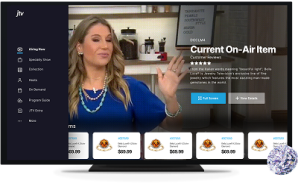
The Baseline Concept
We incorporated the original team's
design but made tweaks to improve
discoverability and usability. This
concept was about speed—getting a
solution to market quickly. While it
offered a rapid path to launch, it didn't
deliver the optimal user experience on
mobile devices we aimed for.
Navigation Grid
Re-establishing Navigation
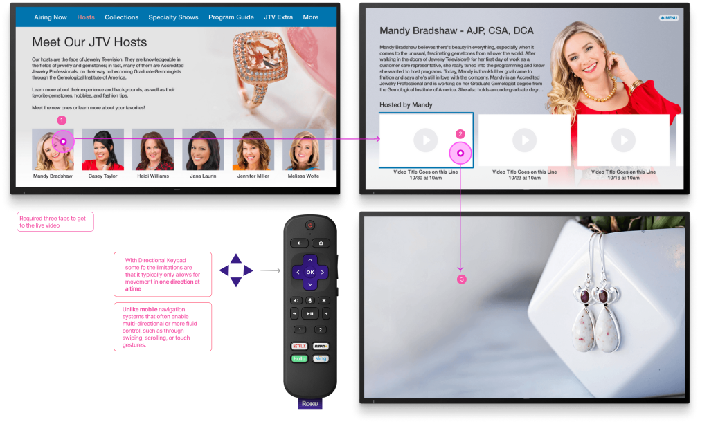
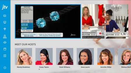
User interviews revealed that many users found it difficult to navigate the grid quickly and locate the content they were looking for. Some users reported having to click 3-4 times before finding the desired content.
The Baseline Concept
We incorporated the original team's
design but made tweaks to improve
discoverability and usability. This
concept was about speed—getting a
solution to market quickly. While it
offered a rapid path to launch, it didn't
deliver the optimal user experience on
mobile devices we aimed for.
Your Monthly Wrap-Up
Aimed to make financial check-ins a
breeze. Your Monthly Wrap-Up
allowed customers to review their
finances each month in just 3 to 15
minutes. By distilling complex financial
data into bite-sized, actionable
insights, it made staying on top of
spending simple and engaging.
Your Financial Fitness
We reimagined financial management
as a health and fitness journey. By
making finance more engaging and
goal-driven, we encouraged users to
set financial goals, track their
progress, and feel a sense of
achievement—much like hitting
personal bests in a fitness app.
Exploring Navigation
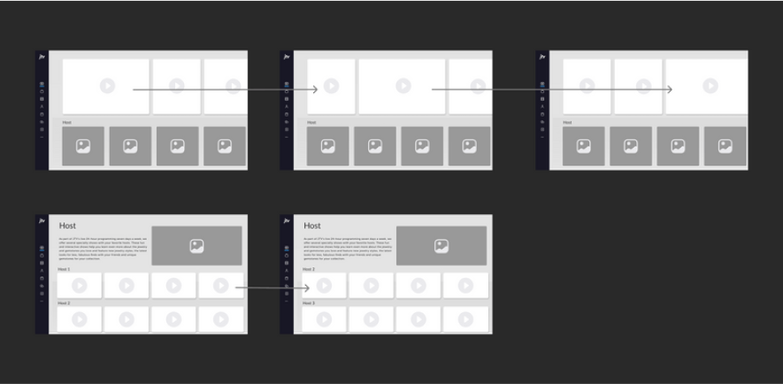
I conducted multiple low-fi and mid-fi tests with users to showcase different flows and collect feedback. This process provided valuable insights into users' natural navigation patterns when using a grid, while also addressing high-priority elements identified by the client. Overall, the tests guided our design decisions, ensuring the final product was both user-friendly and aligned with the needs of users and the client.
Flow 1
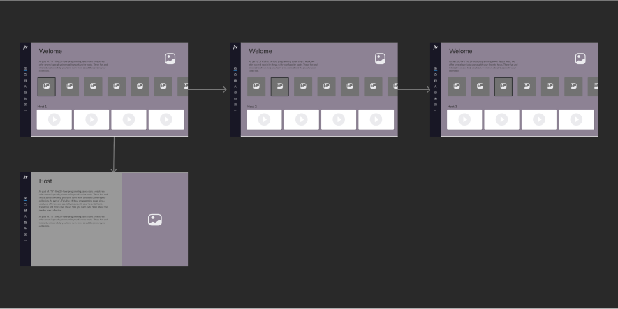
The first row in the design showcases the top three popular videos, which makes it easy for users to quickly access popular content and most recent items. Users can easily switch between popular videos to the specific host or brand video .
Flow 2
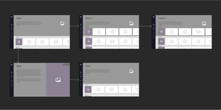
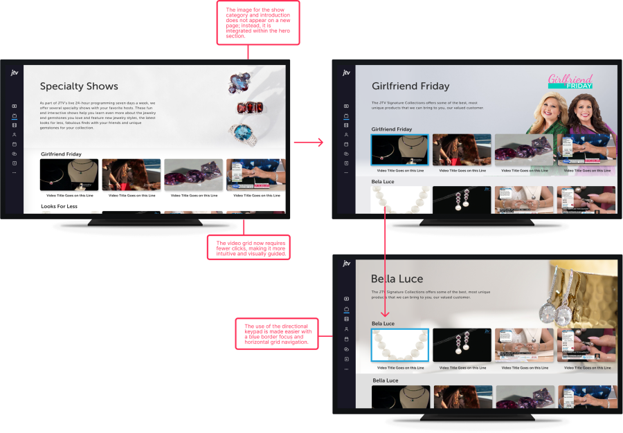
The second incorporated a grid navigation system, where the screen would change based on the selected grid. Each specialty show or host had a dedicated row, and upon reaching the row, the hero image and description would appear in the active grid.
Flow 3
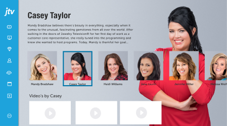
This flow allows the user to select a host, and the selected host's videos will appear in the bottom grid. This reduces the number of clicks required to reach the final video page and provides clarity to the user about their current location.
Safe Zone
I established a safe zone, which refers to the area of the screen where content is guaranteed to be visible on all TVs, regardless of model or screen size. One of the challenges was that the design included fixed images, and every host's text intro needed to fit within this area without being cut off.

Mid-fi Designs
Grid Design Explorations
Well everyone was impacted, but amidst the sea of beneficiaries and stakeholders, I managed to focus on the key streams to surf my way through smoothly.
Option 1
Conducted multiple virtual usability test. Each round had at least 4 users and was followed by an evaluation and some sort of development handoff or feedback. for the purposes of this case study, I will show few key design iterations and the biggest takeaways from the research I conducted.
Option 2
Conducted multiple virtual usability test. Each round had at least 4 users and was followed by an evaluation and some sort of development handoff or feedback. for the purposes of this case study, I will show few key design iterations and the biggest takeaways from the research I conducted.
Option 3
Conducted multiple virtual usability test. Each round had at least 4 users and was followed by an evaluation and some sort of development handoff or feedback. for the purposes of this case study, I will show few key design iterations and the biggest takeaways from the research I conducted.
Option 4
Conducted multiple virtual usability test. Each round had at least 4 users and was followed by an evaluation and some sort of development handoff or feedback. for the purposes of this case study, I will show few key design iterations and the biggest takeaways from the research I conducted.

User Tests
We finalized the first two flows and tested them with users. Due to COVID, most of the tests were conducted online. The first flow was the preferred choice because of the top video, however, the second one was more appreciated for repeated visits and second-time users.
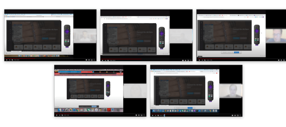
User Tests
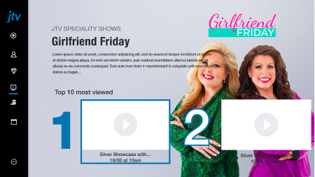
This iteration was focused on the grid design within the JTV app for various sections of the app including Host, speciality shows etc. These designs were a primary focus of the redesign process as the grid guide is by far the most used portion of the current app.
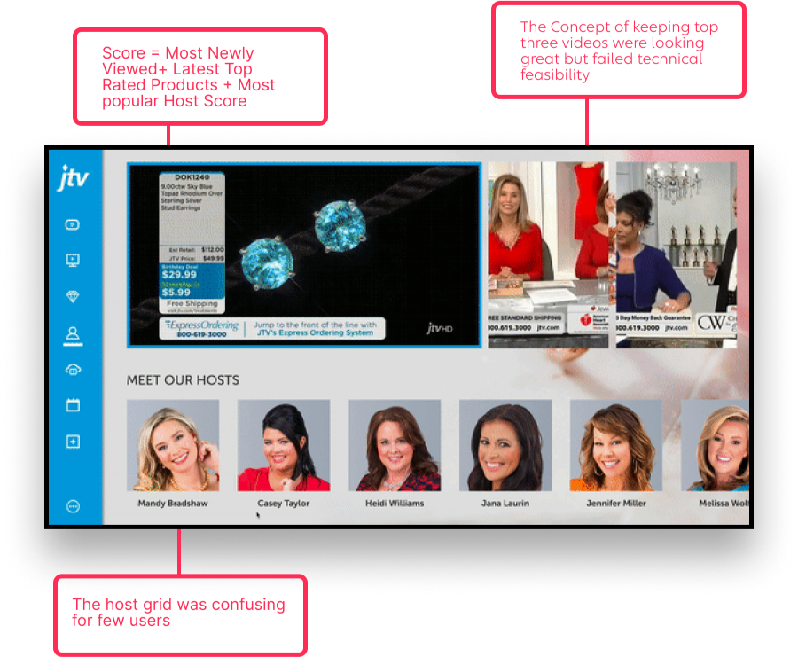
Iteration1
This iteration was focused on the grid design within the JTV app for various sections of the app including Host, speciality shows etc. These designs were a primary focus of the redesign process as the grid guide is by far the most used portion of the current app.
Iteration 2
This iteration was focused on the grid design within the JTV app for various sections of the app including Host, speciality shows etc. These designs were a primary focus of the redesign process as the grid guide is by far the most used portion of the current app.
Iteration 3
This iteration was focused on the grid design within the JTV app for various sections of the app including Host, speciality shows etc. These designs were a primary focus of the redesign process as the grid guide is by far the most used portion of the current app.
Final Grid Designs
We finalized the first two flows and tested them with users. Due to COVID, most of the tests were conducted online. The first flow was the preferred choice because of the top video, however, the second one was more appreciated for repeated visits and second-time users.
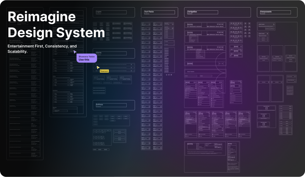
Design system Audit
Hit the Reset Button
We finalized the first two flows and tested them with users. Due to COVID, most of the tests were conducted online. The first flow was the preferred choice because of the top video, however, the second one was more appreciated for repeated visits and second-time users.
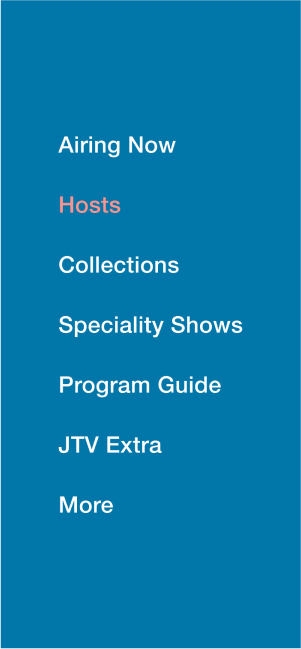
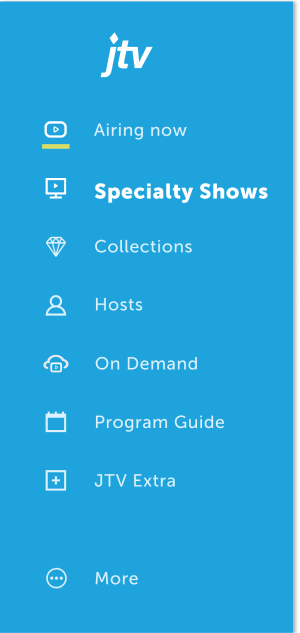
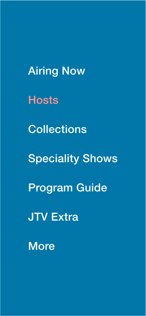
Global Menu Usability Issues
We finalized the first two flows and tested them with users. Due to COVID, most of the tests were conducted online. The first flow was the preferred choice because of the top video, however, the second one was more appreciated for repeated visits and second-time users.

Platform:
Roku below and Fire TV above
•
Flow:
Global Menu
1
Global Menu item selected state
is not visually strong
2
Already Selected item,
is not distinguished
3
4
5
Product Cards
We finalized the first two flows and tested them with users. Due to COVID, most of the tests were conducted online. The first flow was the preferred choice because of the top video, however, the second one was more appreciated for repeated visits and second-time users.
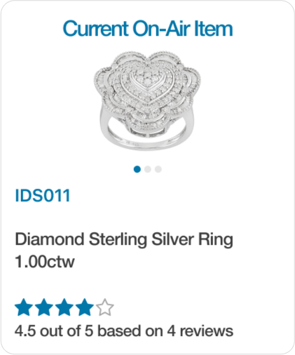
1
Placement of the Card
2
No Product Pricing
3
Product description
not clear
4
Visual Hierarchy
5
Image Carousel on the card,
Very Small in size
Global Menu Usability Issues
We finalized the first two flows and tested them with users. Due to COVID, most of the tests were conducted online. The first flow was the preferred choice because of the top video, however, the second one was more appreciated for repeated visits and second-time users.

1
Placement of the Card
2
No Product Pricing
3
Product description
not clear
4
Visual Hierarchy
5
Image Carousel on the card,
Very Small in size
Video Grid
We finalized the first two flows and tested them with users. Due to COVID, most of the tests were conducted online. The first flow was the preferred choice because of the top video, however, the second one was more appreciated for repeated visits and second-time users.

Design system Audit
Hit the Reset Button
We finalized the first two flows and tested them with users. Due to COVID, most of the tests were conducted online. The first flow was the preferred choice because of the top video, however, the second one was more appreciated for repeated visits and second-time users.
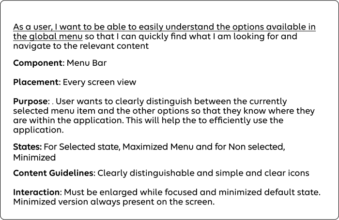
New and Old
We finalized the first two flows and tested them with users. Due to COVID, most of the tests were conducted online. The first flow was the preferred choice because of the top video, however, the second one was more appreciated for repeated visits and second-time users.



New and Old
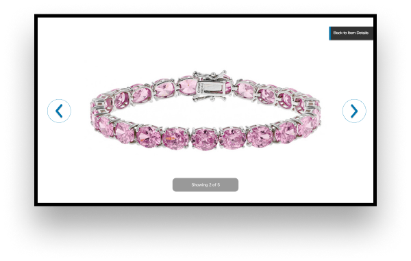
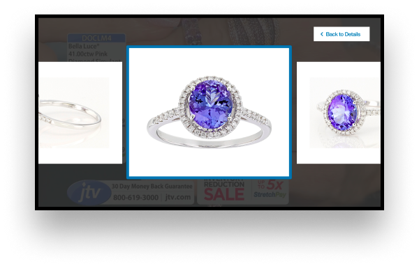
While this iteration was not the “final” round of iteration conducted, it is the final that I will showcase for this case study. This particular round of usability testing is focused on the product views features, show schedule etc.


Research
Design for Live Shows
Since it was my first time designing for TV, the first step was to understand the user's mental model.
Why do people watch TV shows for shopping?
Engagement Prioritization
To get the answers of how and why?
In my initial research, I applied Maslow's hierarchy of needs and found that the app fulfilled most psychological and safety needs. However, it was lacking in addressing self-esteem and self-actualization, as users felt they weren’t skilled at using a smart TV. This was a good starting point to focus on the key usability issues.
Communicate Location
To get the answers of how and why?
In my initial research, I applied Maslow's hierarchy of needs and found that the app fulfilled most psychological and safety needs. However, it was lacking in addressing self-esteem and self-actualization, as users felt they weren’t skilled at using a smart TV. This was a good starting point to focus on the key usability issues.
Live Show
My Role
As the sole designer for the project, I conducted research to understand how people were using the existing app. My responsibilities included designing the UX/UI and presenting the design to both the client and the internal team.
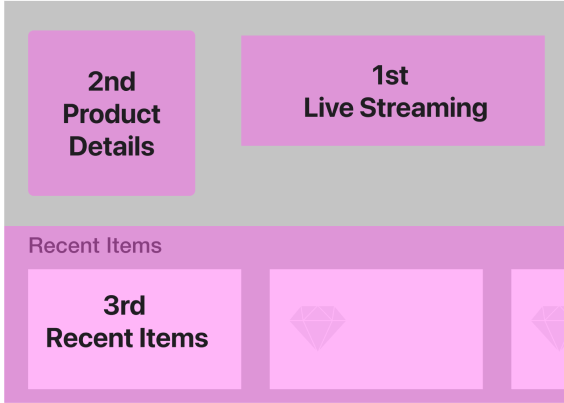
MVp Features
Shaping Product Direction
Well everyone was impacted, but amidst the sea of beneficiaries and stakeholders, I managed to focus on the key streams to surf my way through smoothly.
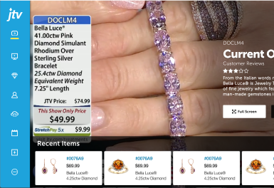
Option 2
he first design option focused on highlighting live shows in full screen mode, with an overlay feature displaying product details.Recently viewed products were also listed for users to easily make a purchase. This design allowed users to easily switch to full screen mode when they were active.
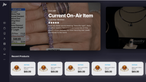
Option 2
As part of the design, I incorporated a toggle between live shows and other recently viewed shows. Recently viewed shows were positioned at the bottom of the screen.
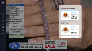
Option 3
The initial design choice included prioritising the live show option as the default to ensure maximum visibility, while placing other recent items at the right of the page.
Hit the Reset Button
Well everyone was impacted, but amidst the sea of beneficiaries and stakeholders, I managed to focus on the key streams to surf my way through smoothly.
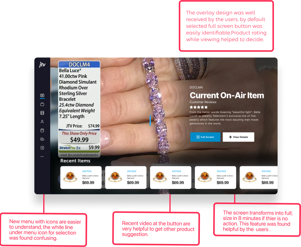
Final live Show Screens
Well everyone was impacted, but amidst the sea of beneficiaries and stakeholders, I managed to focus on the key streams to surf my way through smoothly.
Live Show
This flow allows the user to select a host, and the selected host's videos will appear in the bottom grid. This reduces the number of clicks required to reach the final video page and provides clarity to the user about their current location.

Live Show
This flow allows the user to select a host, and the selected host's videos will appear in the bottom grid. This reduces the number of clicks required to reach the final video page and provides clarity to the user about their current location.

Live Show
This flow allows the user to select a host, and the selected host's videos will appear in the bottom grid. This reduces the number of clicks required to reach the final video page and provides clarity to the user about their current location.

Final Call
A deeper understanding of webOS and Tizen OS: Content is the hero of OTT apps, and designing an app that’s easy to use and pleasant to navigate is instrumental in helping the content reach its full potential and attract the maximum audience.
Through this experience, I became a better designer.
I learned how to conduct effective user research studies. Overall, I became more compassionate towards the millions of people who use the JTV app in their daily lives.
Another major challenge in this project was that we could not design directly for the end user; the solution had to be routed through the companies. This required us to think of the solution in a completely different way, while still being able to solve the core problem.